Inclusive Design for Danish Medical Websites: Process & Insights
Tags: Inclusive Design, UX/UI, Accessibility (WCAG), User Research, Figma Prototype, Double Diamond, Healthcare Digitalization
Time Constraints: 3 months (Bachelor’s Project timeline)
Roles: UX/UI Designer, Scrum Master, User Interviewer, Accessibility Researcher, Prototyper.
This project addresses digital inclusion and accessibility barriers on Danish medical websites. Guided by a structured UX/UI approach (Double Diamond), the process involved comprehensive user research, iterative prototyping, and rigorous testing. The goal was to empower elderly users and vulnerable groups by creating intuitive, accessible, and inclusive digital healthcare experiences.
The Challenge
Digital transformation in healthcare has created new barriers for elderly and vulnerable users, particularly on medical websites in Denmark. Users often encounter complex navigation structures, small typography, confusing language, and poor accessibility features. As a result, important tasks—like booking medical appointments or renewing prescriptions—become frustrating and exclusionary, rather than empowering.
The goal of this project was therefore clear:
How might we use Inclusive and Accessibility Design principles to improve usability for elderly and vulnerable users on Danish medical websites, ensuring intuitive navigation and easy access to essential healthcare services?
My Approach: The Double Diamond Framework
I structured my design process using the Double Diamond model—a proven framework for solving complex problems through a clear, iterative process. The method guided me through four essential phases: Discover, Define, Develop, and Implement, each serving a distinct purpose in creating user-centered solutions.
-
Desk research on existing medical website issues
Literature review on Inclusive and Accessibility Design (WCAG standards)
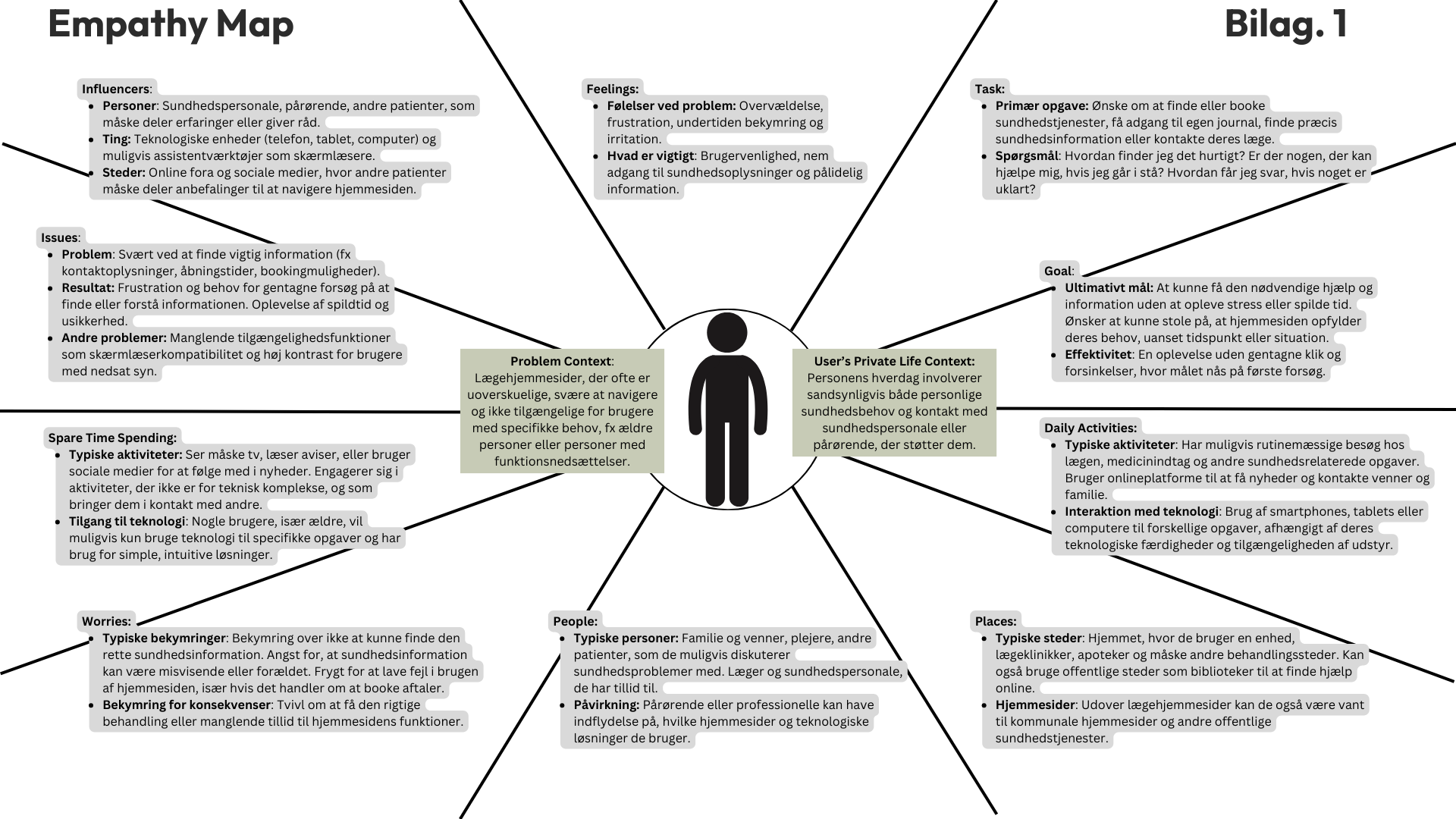
Empathy mapping & user insights
User interviews (Elderly users, healthcare professionals, international users)
Identification of accessibility barriers and usability issues
-
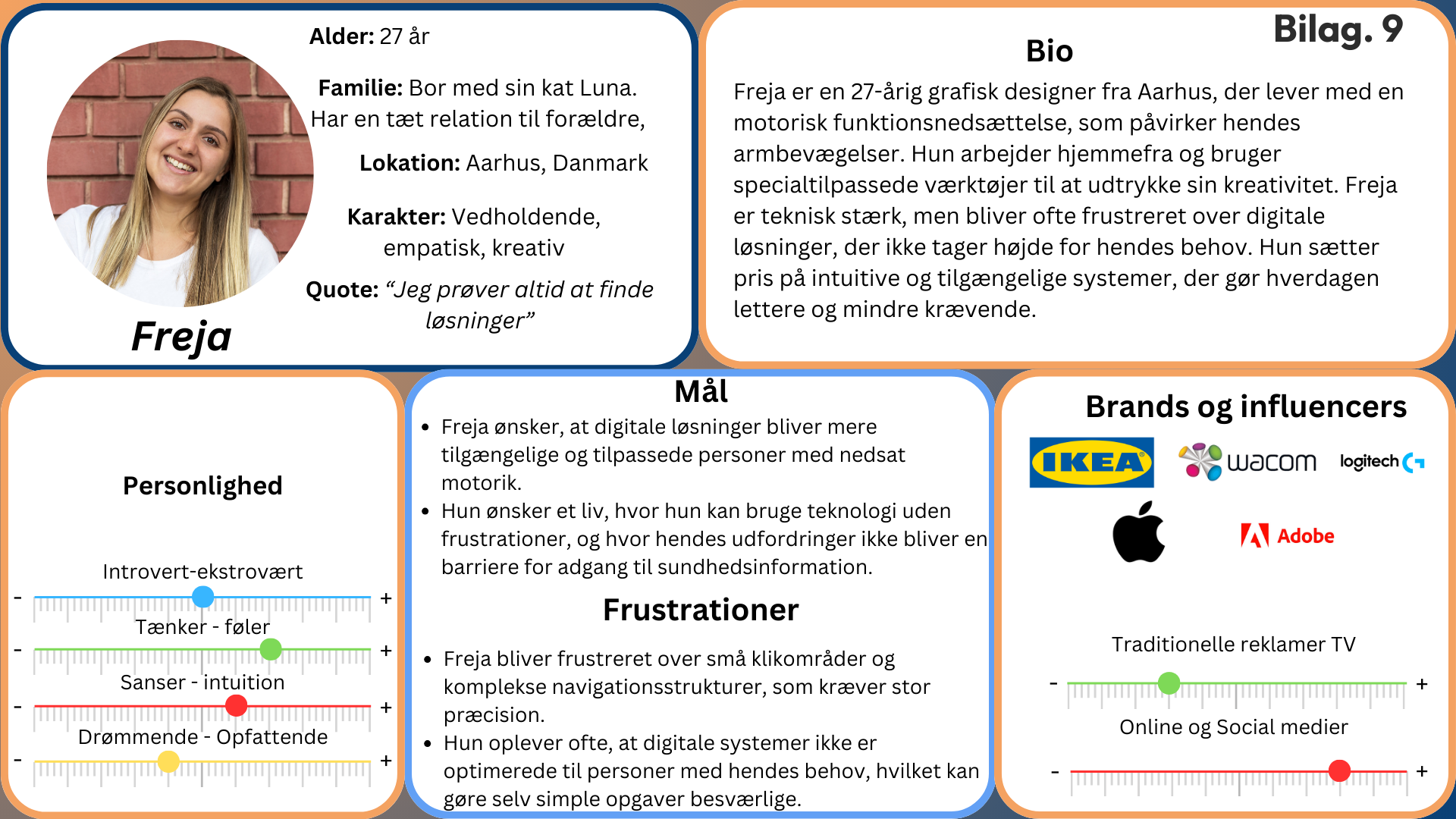
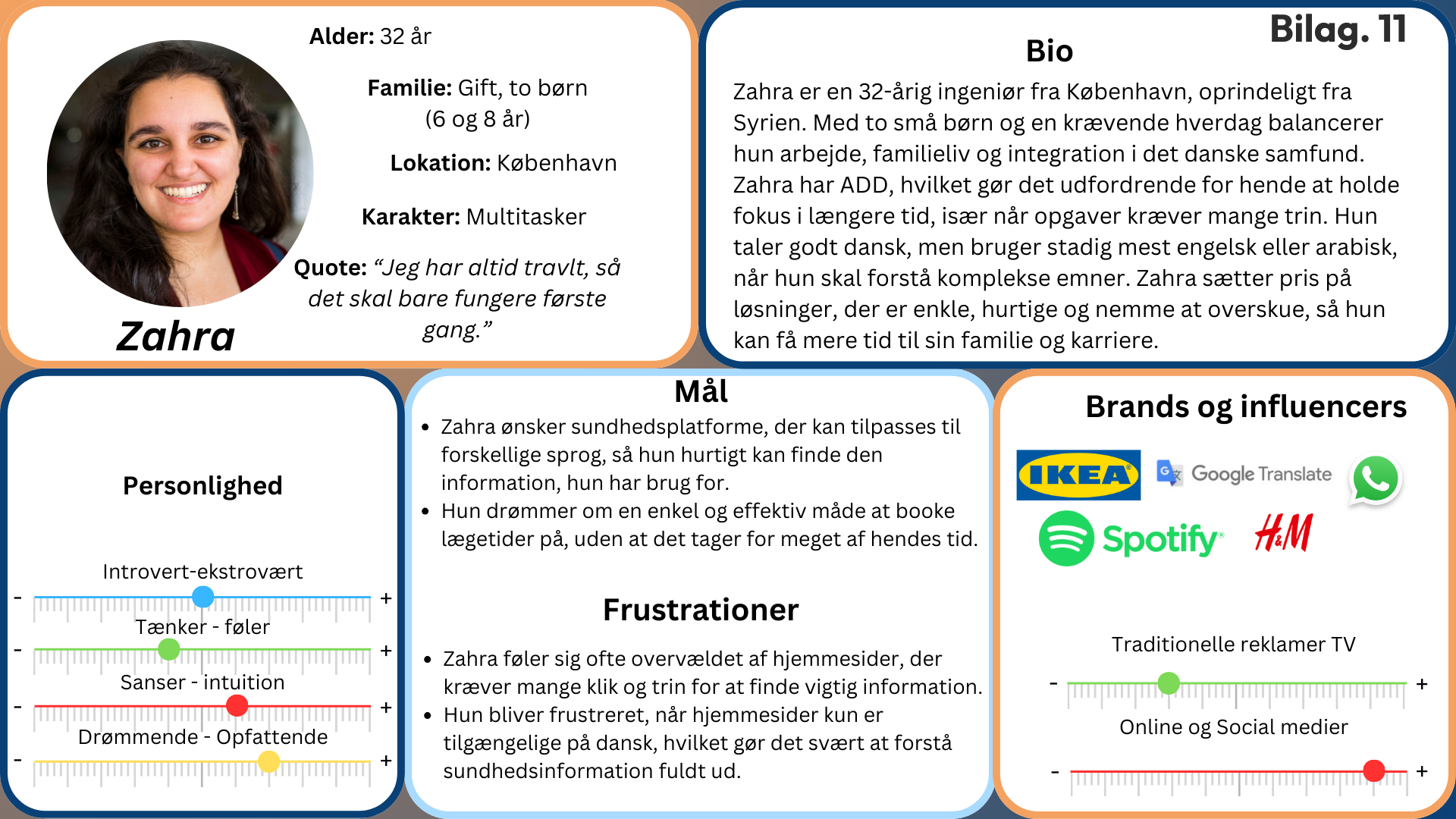
User personas creation (Elderly, motor impairments, multilingual users)
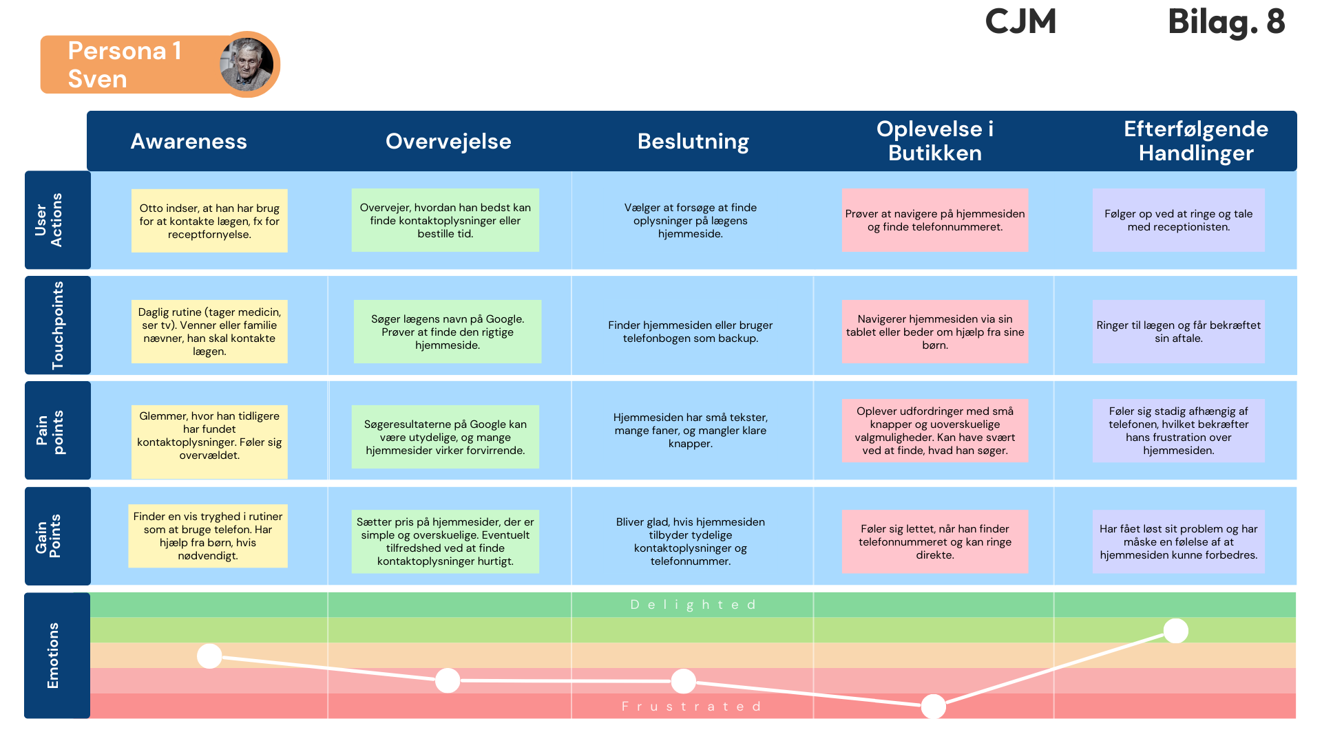
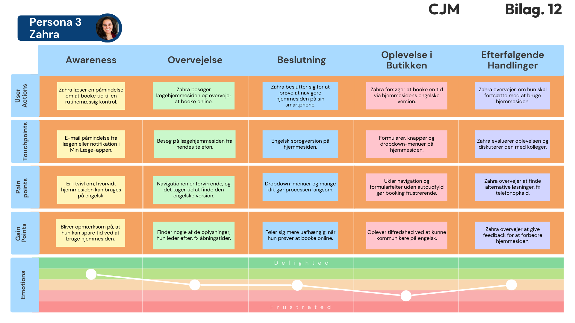
Customer Journey Mapping (CJM)
Business Model Canvas & Value Proposition Canvas
SWOT & strategic analysis (Porter’s 5 Forces, Kotler’s 4 Ps)
Problem statement formulation & user stories
-
Ideation workshops (mind mapping, association, Post-it method)
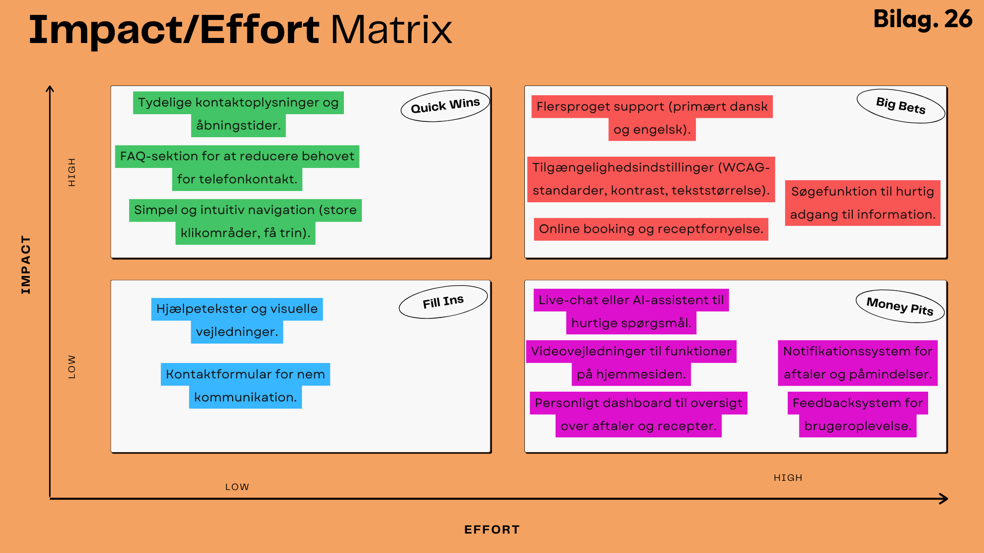
Prioritization techniques (MoSCoW method, Impact-Effort Matrix)
Prototype development in Figma (High-Fidelity)
WCAG-based Inclusive design features integration (adjustable text, contrast, multilingual support)
-
User testing (Navigation and usability tests)
Iterative feedback sessions (Gangster Test, Service Blueprint)
Final refinements based on user insights
Detailed concept description & accessibility implementation
Key Insights & Methods
Discover: Uncovering User Needs & Accessibility Barriers
In the Discover phase, I conducted thorough research to uncover key usability and accessibility challenges faced by users on Danish medical websites. Through user interviews, empathy maps, and literature studies, I identified critical pain points particularly impacting elderly users, multilingual individuals, and those with cognitive or motor impairments. These insights laid a solid foundation for creating simple, intuitive, and inclusive digital solutions.
-
10-Minute Google Search:
Quick exploration to identify common usability issues on medical websites.Desk Research:
In-depth analysis of Inclusive and Accessibility Design literature to understand best practices (WCAG, Inclusive Design principles).Problem Paradox:
Identifying the tension between providing detailed health information and maintaining simplicity and accessibility.Empathy Maps:
Visual mapping to capture emotional experiences and frustrations of users interacting with medical websites.Interviews:
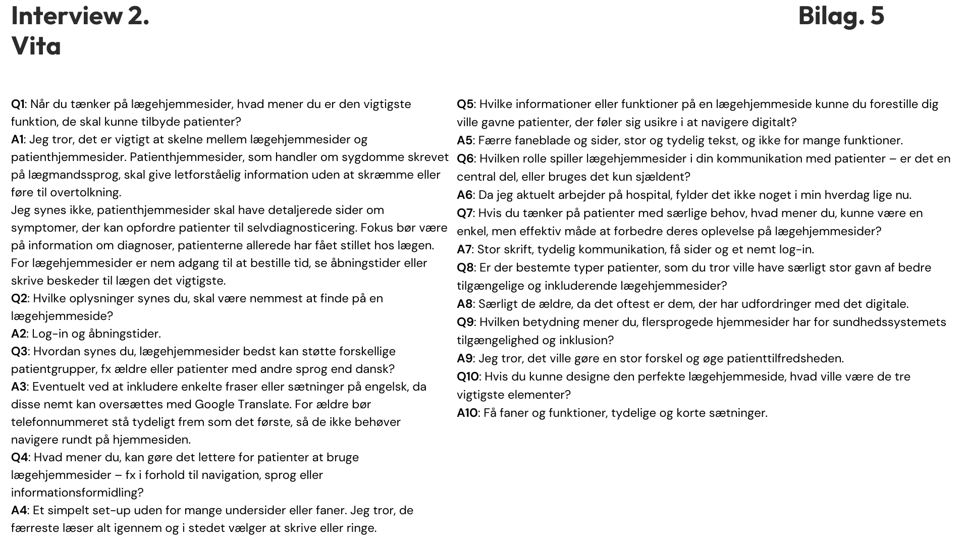
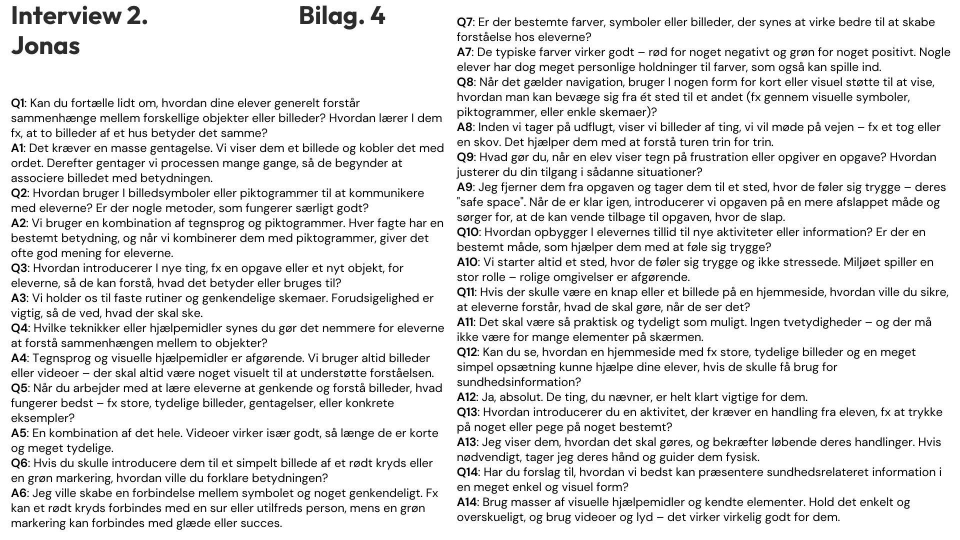
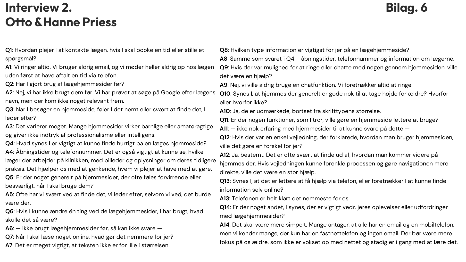
Conducted interviews with elderly users, multilingual users, a healthcare professional, and a specialist teacher to gather firsthand user insights. -
Navigation structures on medical websites are overly complex and frustrating, especially for elderly and multilingual users.
Poor visual accessibility, including low contrast, small fonts, and confusing layout.
Significant language barriers negatively affect usability for non-Danish-speaking users.
Users strongly prefer simple designs, clear information, fewer clicks, and intuitive interaction.
-
“Many websites assume everyone has email and mobile phones. Websites must focus more on elderly people who didn't grow up with the internet.”
- Elderly users (Otto & Hanne)“Websites need simple layouts and clear visuals, especially for users with cognitive or motor impairments. Too much information or unclear visuals cause frustration.”
- Specialist Teacher (Jonas)“Medical websites should have fewer tabs, simpler structures, and clearly visible essential information.”
- Healthcare Professional (Dr. Vita Djamilla Sandeman)


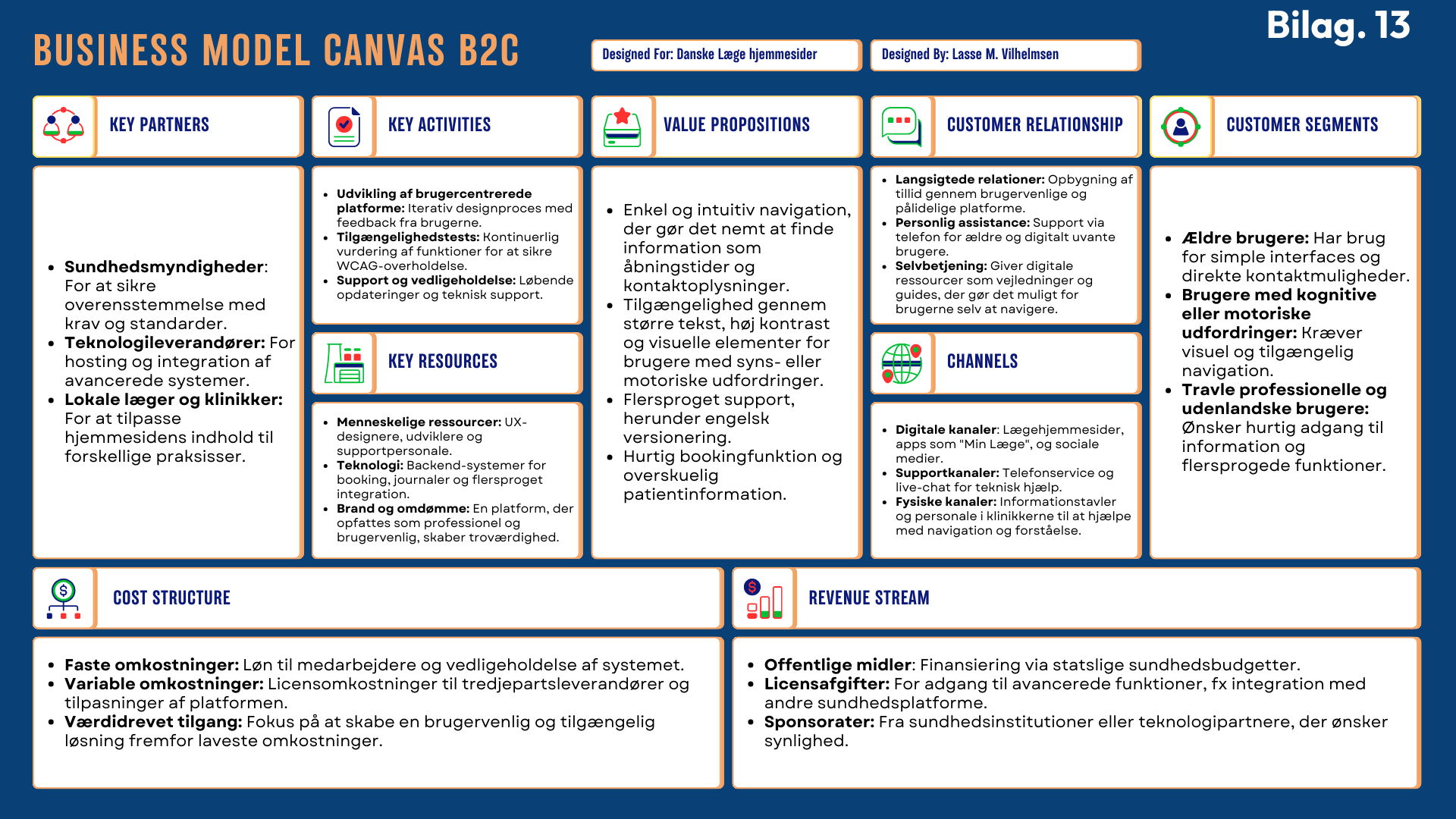
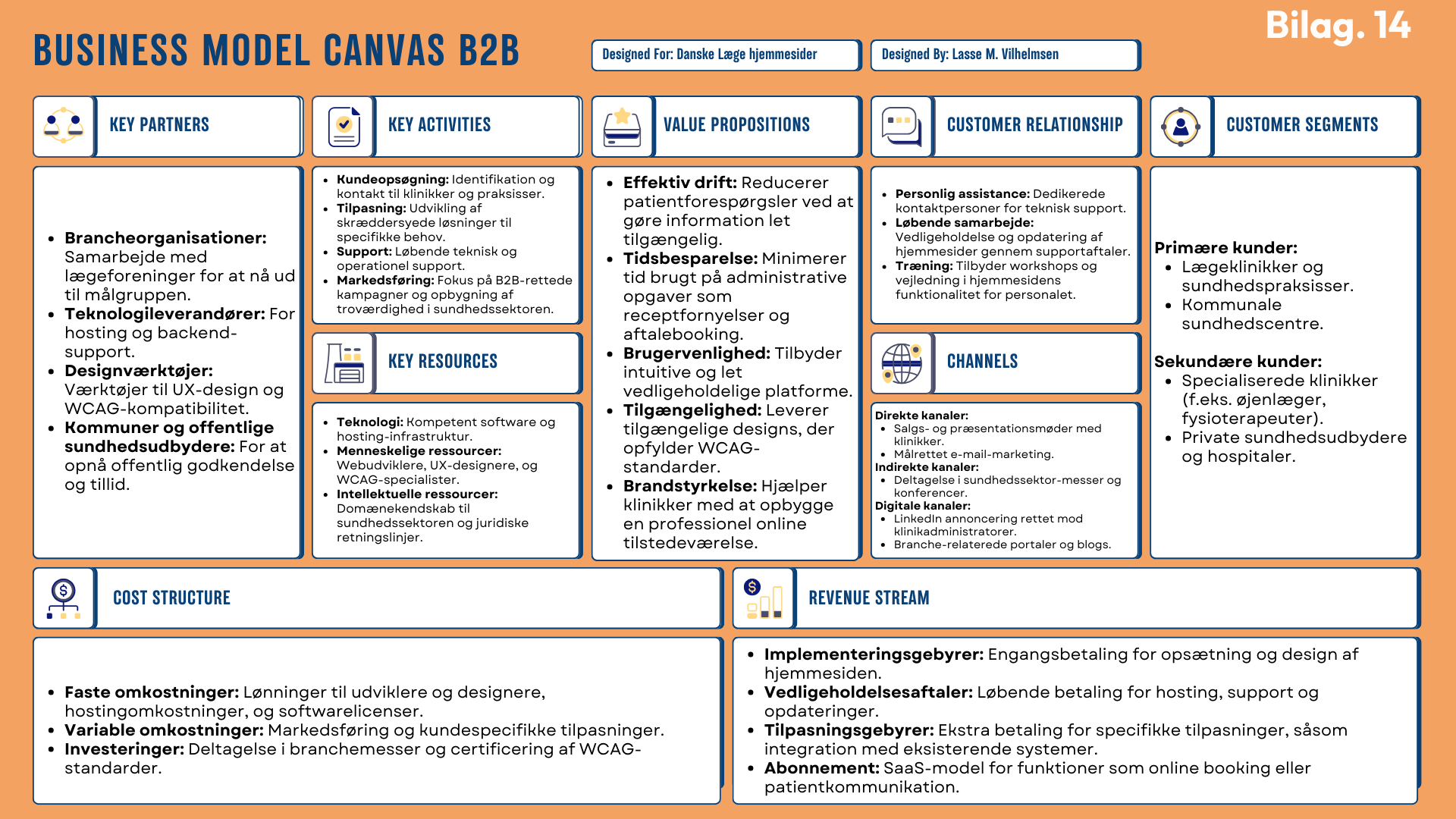
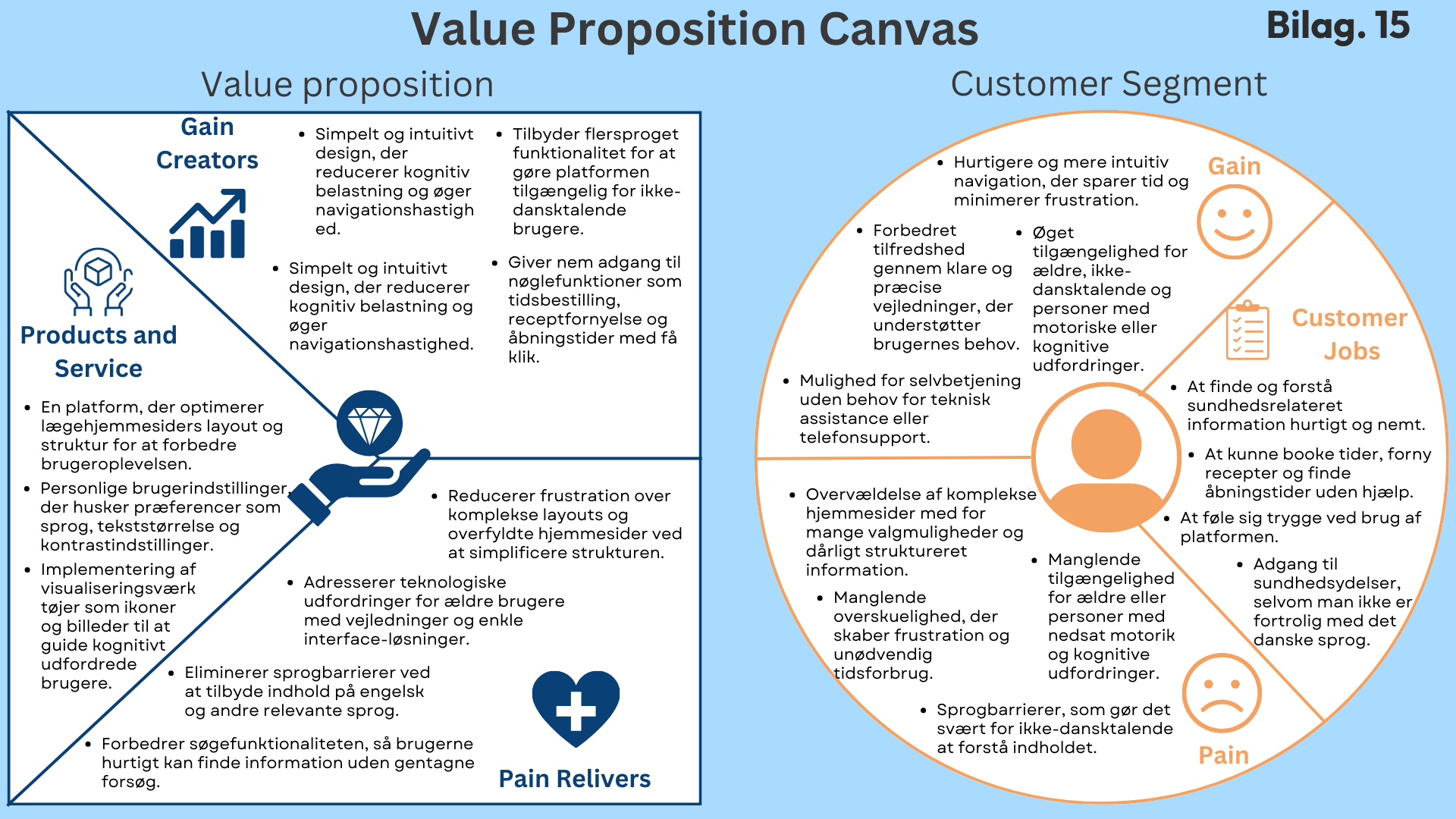
In the Define phase, I structured and clarified the project's core challenges and strategic opportunities, focusing on user needs, competitor analysis, and clear business value. By developing Personas, Customer Journey Maps, and strategic frameworks such as the Business Model Canvas and Value Proposition Canvas, I defined clear goals and outlined a solution that emphasizes accessibility, usability, and inclusivity. This phase created a robust foundation for targeted design improvements and prototype development.
Define: Framing User Needs & Strategic Opportunities
-
Personas & Customer Journey Maps (CJM)
Created realistic user representations and visualized interactions to highlight pain points, enabling a focused, user-centered design approach.Business Model Canvas (BMC) & Value Proposition Canvas (VPC)
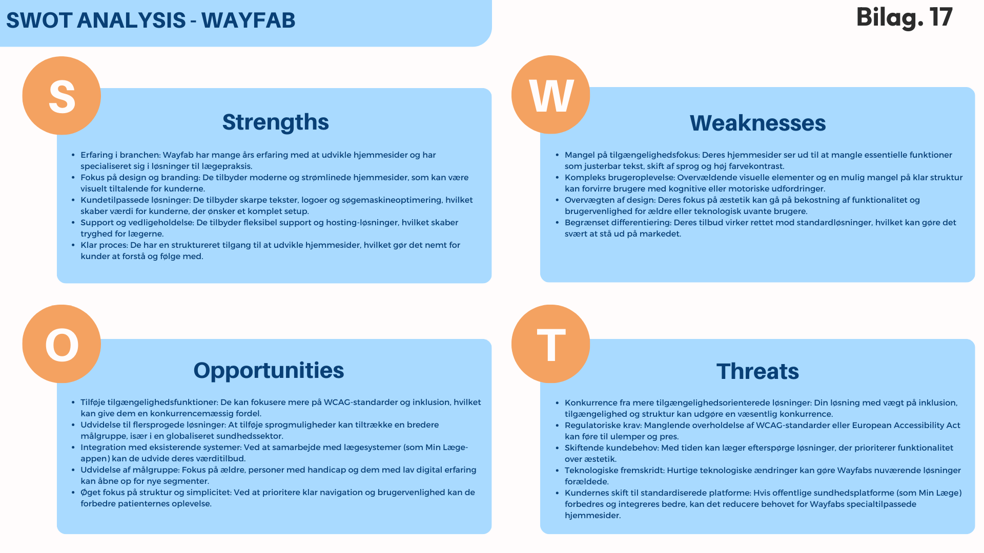
Strategically defined how the solution creates value for users and medical practices, ensuring alignment with real-world needs and business goals.Competitor Analysis (SWOT, Porter’s 5 Forces, Kotler’s 4 P’s)
Analyzed market competitors in depth to identify strategic opportunities, gaps, and areas for differentiation.Problem Statement
Clearly articulated the core issues faced by users, framing the project’s purpose and providing a targeted direction for inclusive design solutions.User Stories
Translated user needs into specific design and functionality requirements, ensuring that development remains user-focused and practical.Design Brief
Structured the project's scope, goals, and success criteria, providing clarity and direction throughout the design and development process. -
Inclusive and User-Focused Solutions: Users require intuitive and accessible medical websites tailored specifically to elderly, motor-impaired, and multilingual individuals.
Clear Strategic Positioning: A clear market gap exists for solutions prioritizing accessibility and functionality, differentiating effectively from competitors focused mostly on aesthetics.
Balanced Simplicity and Functionality: Optimal user experiences balance simplified, intuitive design with robust functionality, addressing identified pain points directly.
Personalized User Journeys: Clearly defined user stories and personas ensure targeted and effective design decisions that reduce frustration and enhance efficiency.
Scalable and Sustainable Design Framework: Establishing structured guidelines for inclusive design ensures the solution remains adaptable and maintains value over time.
-
Balancing Diverse User Needs: Ensuring the design meets diverse accessibility requirements without compromising usability for any specific group proved challenging.
Complexity of Inclusive Features: Integrating comprehensive accessibility features (e.g., multilingual support, adjustable fonts, simplified navigation) required careful prioritization and planning.
Aligning Strategic and User-Centric Goals: Balancing strategic business objectives (identified through BMC and VPC) with the practical, user-centered design insights presented complexity.
Effectively Communicating Accessibility’s Value: Clearly articulating the importance and benefits of inclusive design strategies was crucial for setting a solid foundation for future development stages.


In the Develop Phase, the goal was to transition from strategic insights and defined concepts into concrete, practical design solutions. Using structured ideation techniques, prioritization methods, and prototyping, I translated user needs and accessibility requirements into intuitive, inclusive medical website prototypes. This iterative process ensured designs aligned closely with user expectations and WCAG standards, laying a strong foundation for effective and inclusive digital healthcare solutions.
Develop: Transforming Insights into Actionable Design Solutions
-
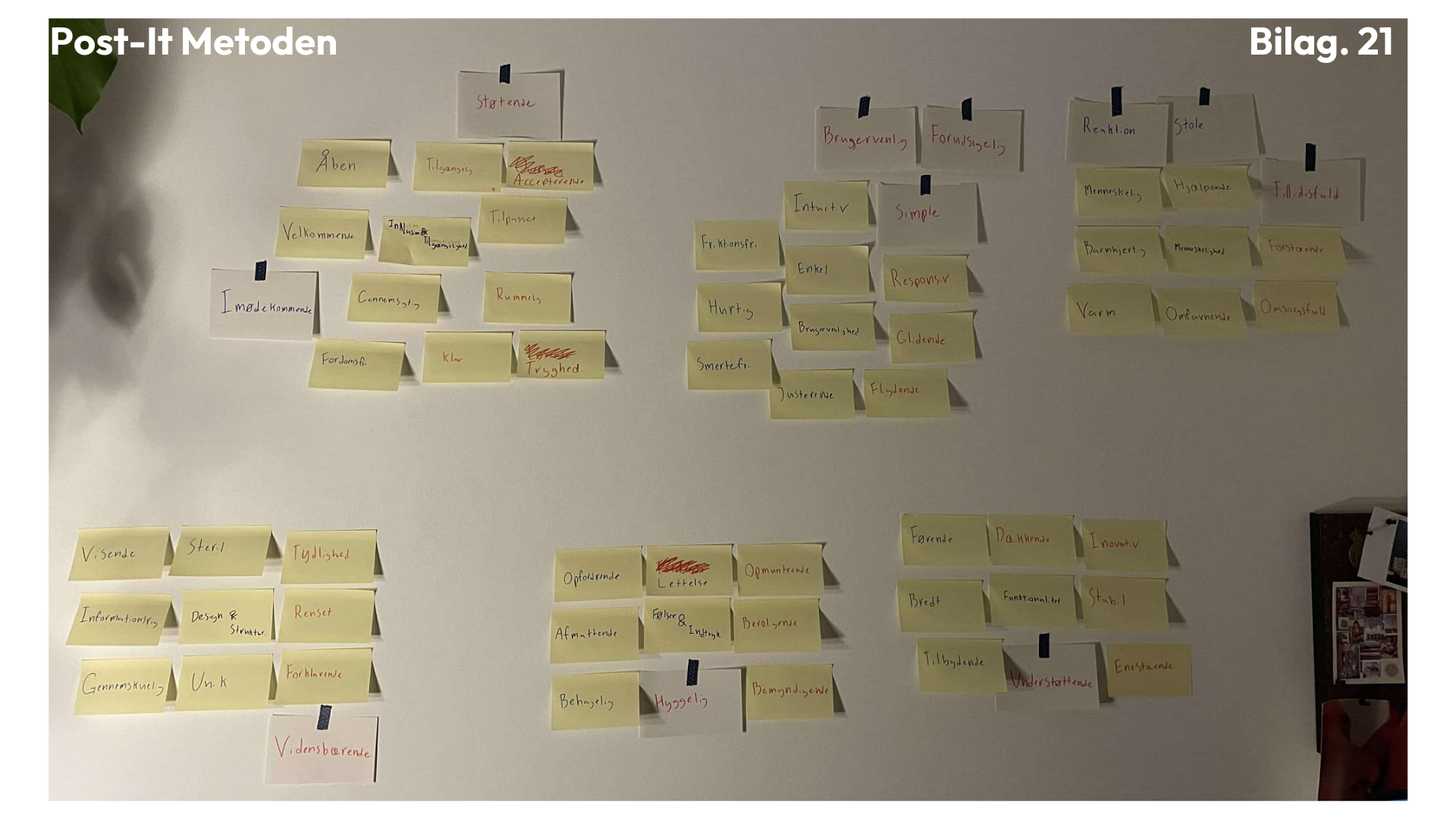
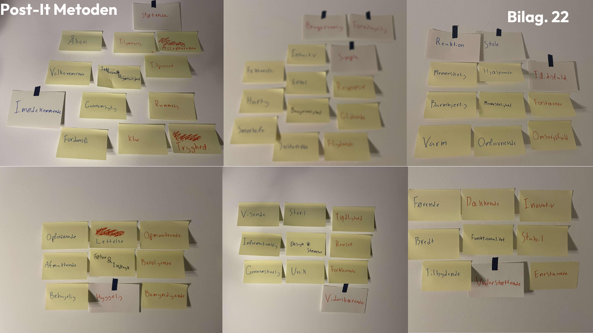
Association & Post-it Method
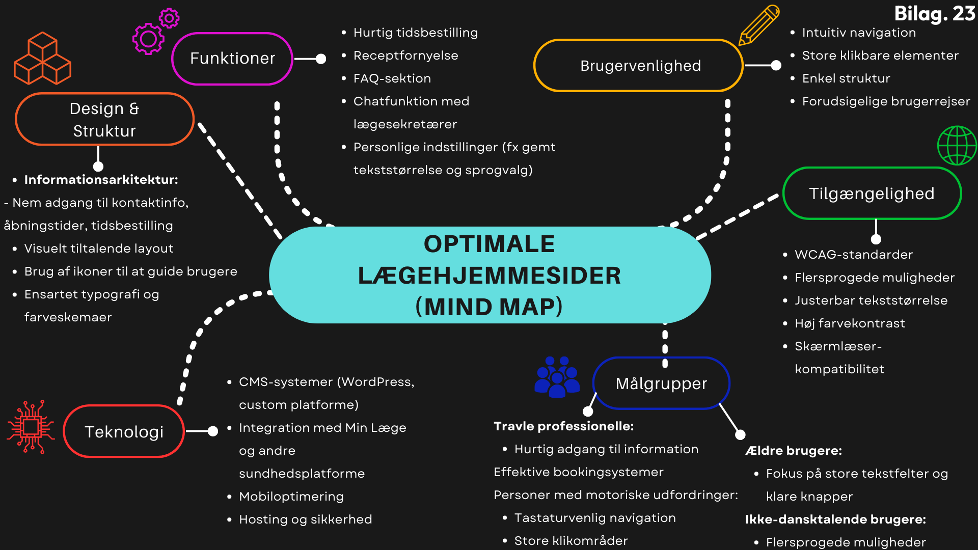
Creatively generated and grouped keywords into clear themes, identifying core emotional and functional design attributes necessary for inclusive medical websites.Mind Map
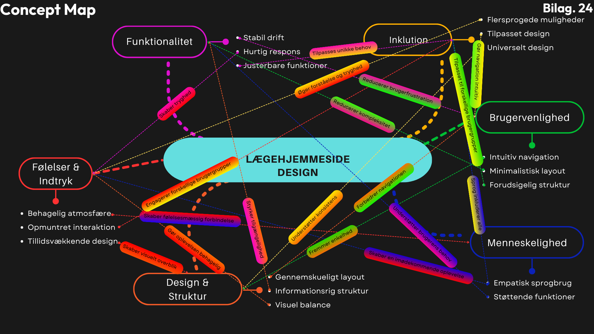
Visually structured key functionalities and user needs, clarifying connections and ensuring a cohesive and comprehensive approach to accessibility and usability.Concept Map
Mapped the complex interactions between inclusivity, usability, and emotional design aspects, providing clarity on how each element supports a seamless and positive user experience.MoSCoW Analysis & Impact–Effort Matrix
Strategically prioritized features by evaluating their critical importance and implementation effort, ensuring a balanced approach to resource allocation and maximum user impact.Evaluation of Existing Medical Websites
Assessed current medical websites systematically for accessibility and usability gaps, identifying concrete opportunities for significant improvement and differentiation.Prototype Development
Translated insights into tangible, iterative designs through sketches, wireframes, and interactive prototypes, allowing for effective testing, refinement, and validation of the inclusive design concept. -
Simplicity and intuitive navigation are crucial to reduce confusion and frustration among users.
Emotional aspects, such as warmth, empathy, and reassurance, significantly enhance user trust and satisfaction.
Prioritizing features using methods like MoSCoW and Impact–Effort Matrix effectively aligns design goals with user needs and available resources.
Most existing medical websites lack critical accessibility features, revealing significant opportunities for innovation and improvement.
Iterative prototyping and ongoing feedback loops are essential to creating practical, user-focused solutions that truly address accessibility barriers.
-
Solo Project Limitations: Working alone meant critical design decisions had to be made without the valuable input and critique typically gained through collaboration, sometimes leading to uncertainty.
Time Constraints: Tight deadlines restricted the depth and scope of the iterative design process, occasionally resulting in rushed decisions, particularly concerning navigation structures and feature prioritization.
Compromises in Functionality: Due to the limited time available, certain desired features—such as advanced interactive elements or comprehensive multilingual support—had to be simplified or omitted to ensure core functionalities could be delivered effectively.
Balancing Accessibility and Design: Consistently meeting WCAG accessibility standards while creating an aesthetically pleasing and user-friendly interface presented significant design challenges, requiring careful prioritization and trade-offs.
Scope Management: The extensive range of user needs identified during research made it challenging to define a focused and manageable scope, necessitating difficult decisions regarding feature inclusion and complexity reduction.


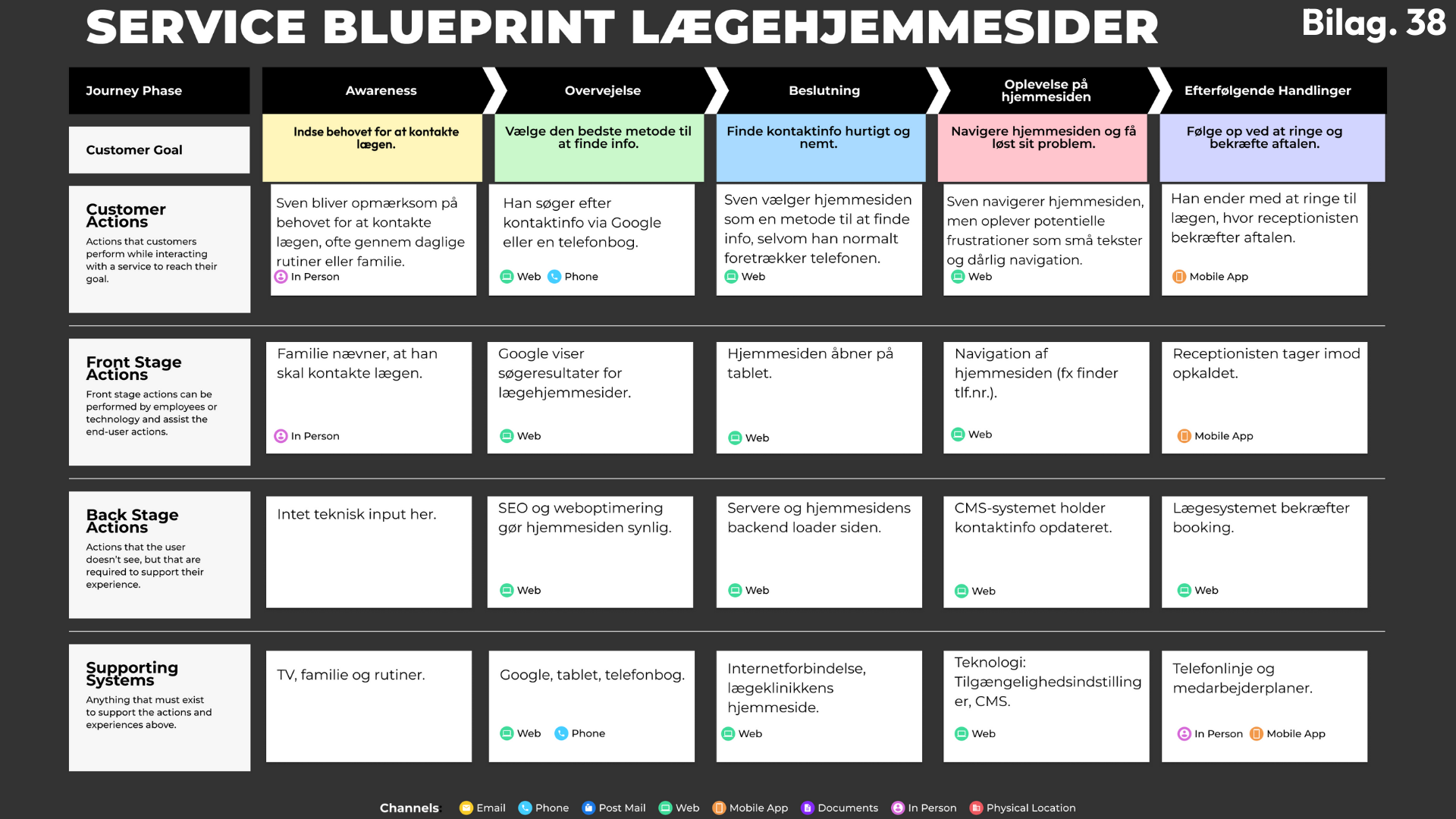
Implement: Testing & Refinement
In the implementation phase, my high-fidelity prototype was rigorously tested and optimized through targeted methods such as the Gangster Test, Service Blueprinting, and continuous iteration. These methods provided crucial insights, ensuring the prototype met user expectations for intuitive navigation, accessibility compliance (WCAG standards), and a seamless user experience, ultimately delivering a design that effectively addresses user needs and enhances usability.
-
Gangster Test
Identified usability issues and validated the intuitiveness of navigation, ensuring critical tasks were quickly discoverable and user-friendly.Service Blueprint
Visualized user interactions (frontstage and backstage) and uncovered pain points, clarifying how to optimize both user experience and internal processes.Concept Description & Feature Walkthrough
Detailed documentation of key features, visual elements, and their rationale, clearly demonstrating how the design addresses user needs and enhances accessibility.Implementation of Inclusive Design & WCAG Standards
Ensured the prototype's compliance with accessibility guidelines, incorporating adjustable features like text sizing, high-contrast modes, and simplified navigation for diverse user groups. -
Clear and intuitive placement of accessibility and language settings significantly enhances overall user navigation and reduces confusion.
Simplified and decluttered header designs dramatically improve usability by highlighting critical functions and minimizing cognitive overload.
Implementing sticky navigation and “Back-to-Top” buttons directly contributes to better user experiences, especially for elderly and motor-impaired users.
Compliance with WCAG standards, such as adjustable text sizes and contrast settings, notably increases accessibility for visually impaired and multilingual users.
-
Relocation of Accessibility Features:
Moving accessibility and language icons from the left to the right corner streamlined navigation and improved intuitiveness.Simplified Header Structure:
Reducing redundant information from the header eliminated unnecessary cognitive load, creating a cleaner and more efficient user interface.Enhanced Navigation Tools:
Introducing sticky navigation and a "Back-to-Top" button significantly improved page usability, especially for lengthy content, supporting users with motor or cognitive challenges.Optimized Content Placement:
Reallocating guides and instructional content to more logical sections, like "Practical Information," greatly enhanced discoverability and user satisfaction.


Results & Impact
The developed prototype successfully demonstrated the critical value of Inclusive Design in digital healthcare. By implementing WCAG standards, intuitive navigation, multilingual support, and customizable accessibility settings, the solution significantly reduced barriers and enhanced usability for elderly, disabled, and multilingual users. Beyond improving individual user experiences, the design approach showed clear potential to increase operational efficiency and reduce resource demands on healthcare clinics. This project highlights how thoughtful design improvements can foster greater inclusivity, social equality, and practical effectiveness in digital health platforms.
How were critical design decisions made
Critical design decisions were informed by iterative user research, structured testing methods, and direct user feedback. Techniques like personas, empathy mapping, user journeys, and prototype testing provided actionable insights into user frustrations and needs. Competitive analysis and prioritization frameworks (MoSCoW, Impact-Effort Matrix) further guided strategic choices, balancing user-centric improvements with practical feasibility. This approach ensured that each decision was both grounded in real-world user requirements and aligned with inclusive design principles.
From Idea to High-Fidelity Prototype
This section showcases the progression of my design work—from early conceptual sketches to an interactive high-fidelity prototype. Each stage builds on the last, translating insights into structure, functionality, and refined visuals. While the final prototype doesn't fully capture the entire vision due to time constraints and the solo nature of the project, it lays a strong and functional foundation for future development and iteration.
Sketches
Initial hand-drawn sketches capturing core layout ideas, functional elements, and content flow.
>
Wireframes
Low-detail structural layouts used to map content hierarchy and page structure without visual distraction.
>
Low-Fidelity Prototype
An early interactive version that connects key pages and demonstrates basic navigation logic.
>
Linked Page Overview
Expanded low-fidelity prototype showing page connections and navigation pathways, forming the foundation for user journeys.
>
High-Fidelity Prototype
A polished version with color, typography, and UI elements—designed with accessibility and user-friendliness in mind.
Final product
While not a complete representation of the full vision, this prototype reflects the most critical functions and inclusive principles identified throughout the process. Given the time frame and solo effort, some compromises were necessary—leaving clear opportunities for future refinement.
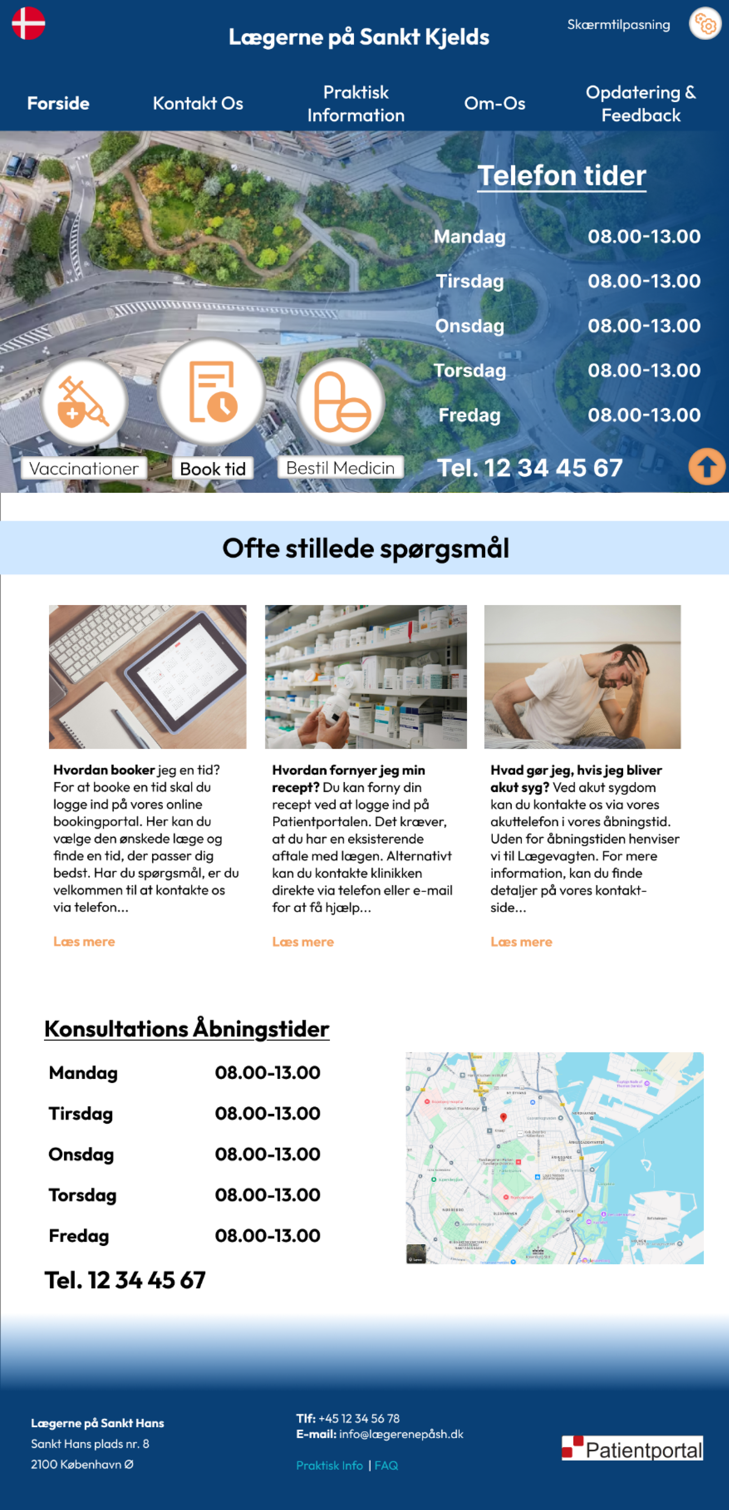
Front page

Contact Information

Practical Information
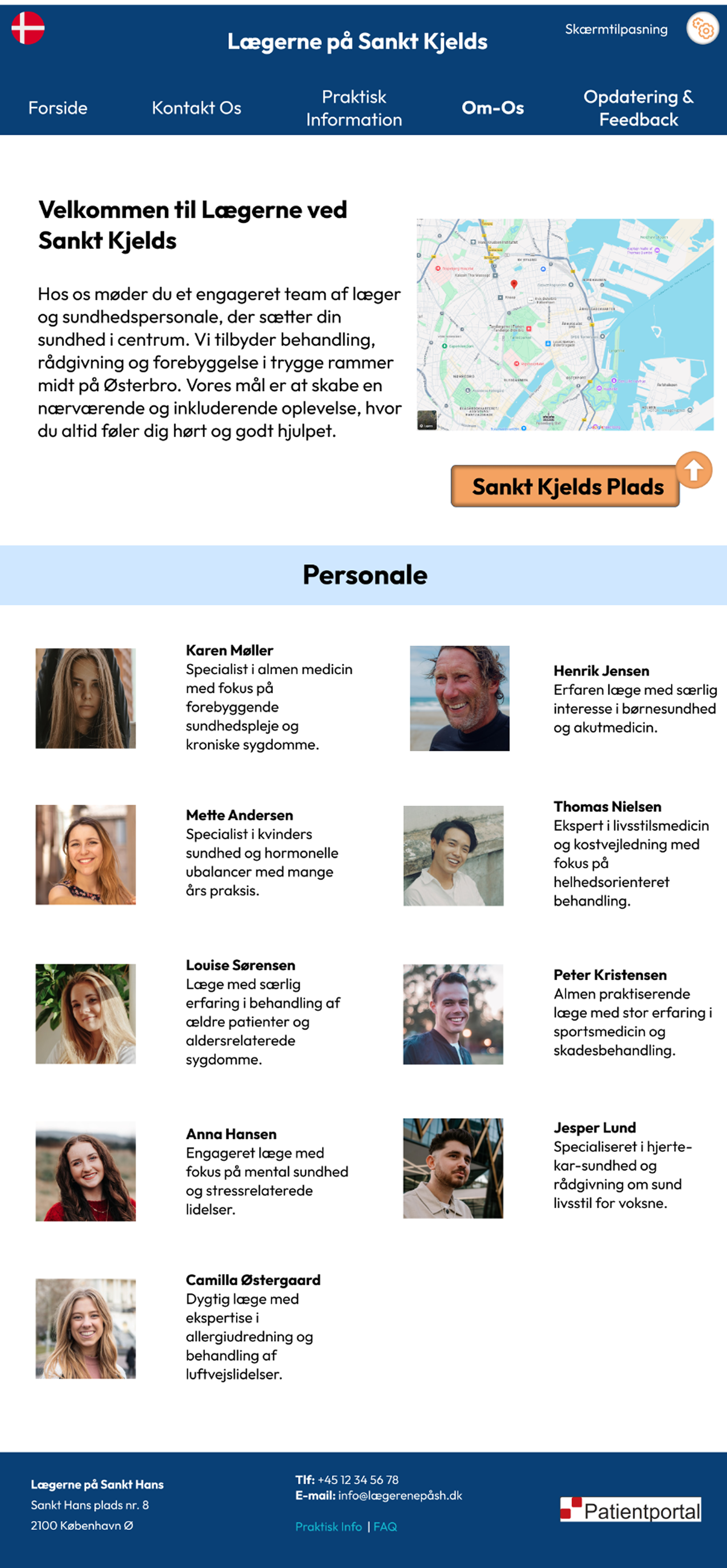
About Us
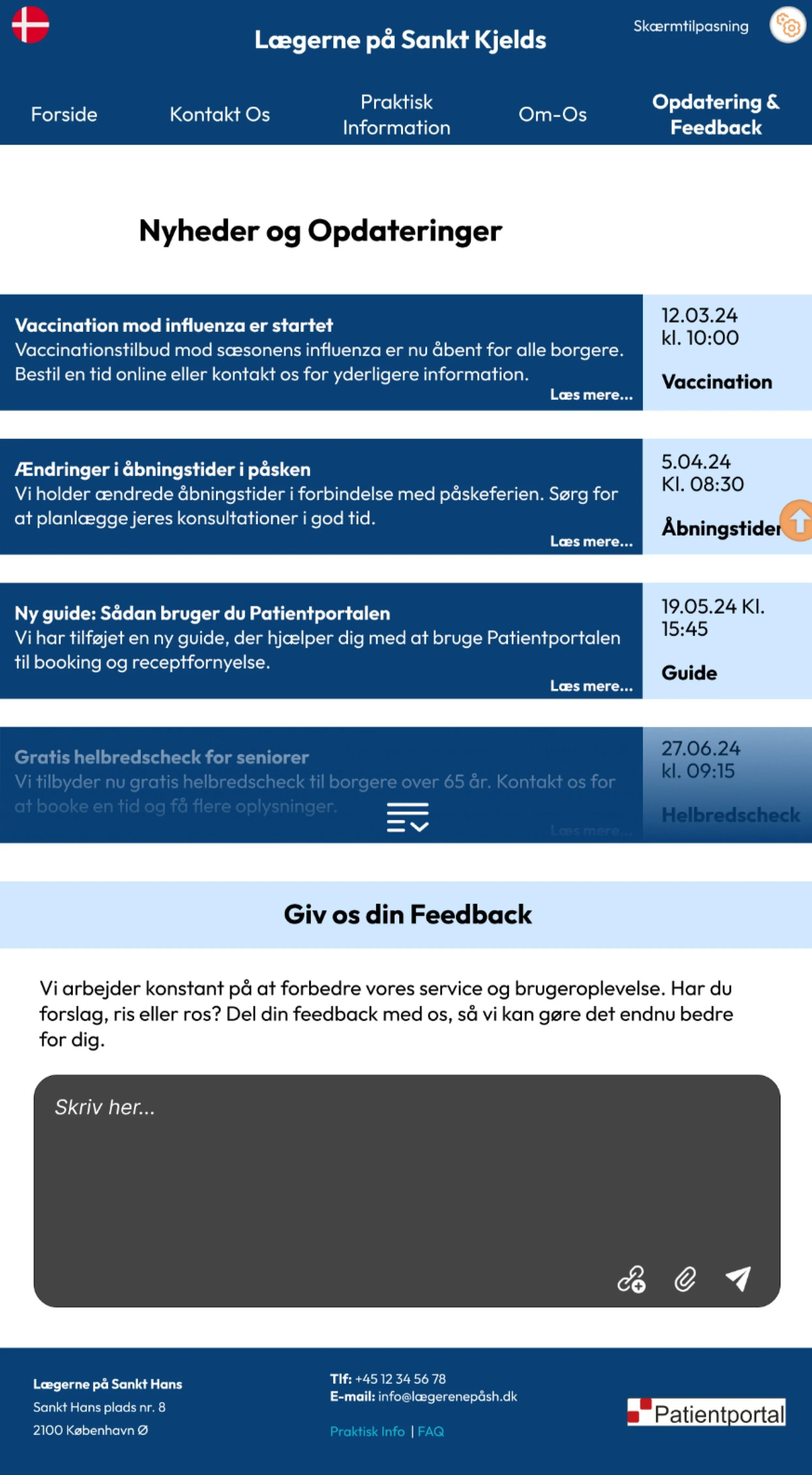
Updates & feedback

Display Settings
What it’s like working solo on a large-scale project
Managing a comprehensive project independently challenged me to balance multiple roles—researcher, designer, and strategist. While it offered creative freedom, it also required disciplined time management, strategic prioritization, and self-driven decision-making. The lack of direct collaboration meant relying heavily on structured user feedback and iterative testing to validate ideas. Ultimately, working solo sharpened my ability to make informed, user-centered decisions, adapt quickly, and clearly communicate the value of inclusive design solutions.

What’s next?
Moving forward, the next steps will include deeper user testing, particularly with elderly users and individuals with special needs, to further validate and refine the inclusive design. Developing a dedicated mobile version is essential to ensure accessibility across all devices, informed by deeper research into users’ platform preferences and behaviors. Additionally, exploring more advanced UX methodologies such as future scenario planning, enhanced data visualization techniques, and creating a fully functional screen customization feature would further elevate usability.
Quantitative surveys conducted post-project highlighted clear areas for improvement, such as navigation simplicity, faster appointment booking, clearer information architecture, and standardized design practices across medical websites. Addressing these insights through targeted UX enhancements and possibly exploring an all-in-one app solution would significantly improve overall user satisfaction and ensure long-term effectiveness of the platform.